Ukraine – Photo-roman
Posted: May 12, 2015 Filed under: subject | Tags: art, illustration, photo-roman, Russia, Ukraine, video Leave a commentUsing the images from my Ukraine conflict project I have created a photo-roman, a film composed of stills. To go with the images I have selected various sound clips. The first section begins with sounds of the riots in Maidan which go with the images from the event. This is followed by a news report of the MH17 crash, followed by more sounds of the riot against some rather still images. Then images from the battle of Donetsk are accompanied by sounds of rebels taking and tormenting Ukrainian soldiers, I have used sound effects to aid the effect of zooming in on the situation. Over the Images of Boris Nemtsov death is Putin’s victory speech from the election. The last images are accompanied by Ukrainian pianist Vladamir Horowitz playing a piece by Scriabin a Russian Composer. Over the top of this is a recording from a vigil to remember the lives lost in the Maidan riots.
Small Paintings to Sell
Posted: May 11, 2015 Filed under: subject | Tags: art, illustration, observation, oil paint, still life Leave a commentAlong with the four larger images I made sixteen A5 oil paintings.


Pictures for Exhibition in Paper Gallery
Posted: May 11, 2015 Filed under: subject | Tags: art, exhibition, food, gallery, illustration, observation, oil paint, still life Leave a comment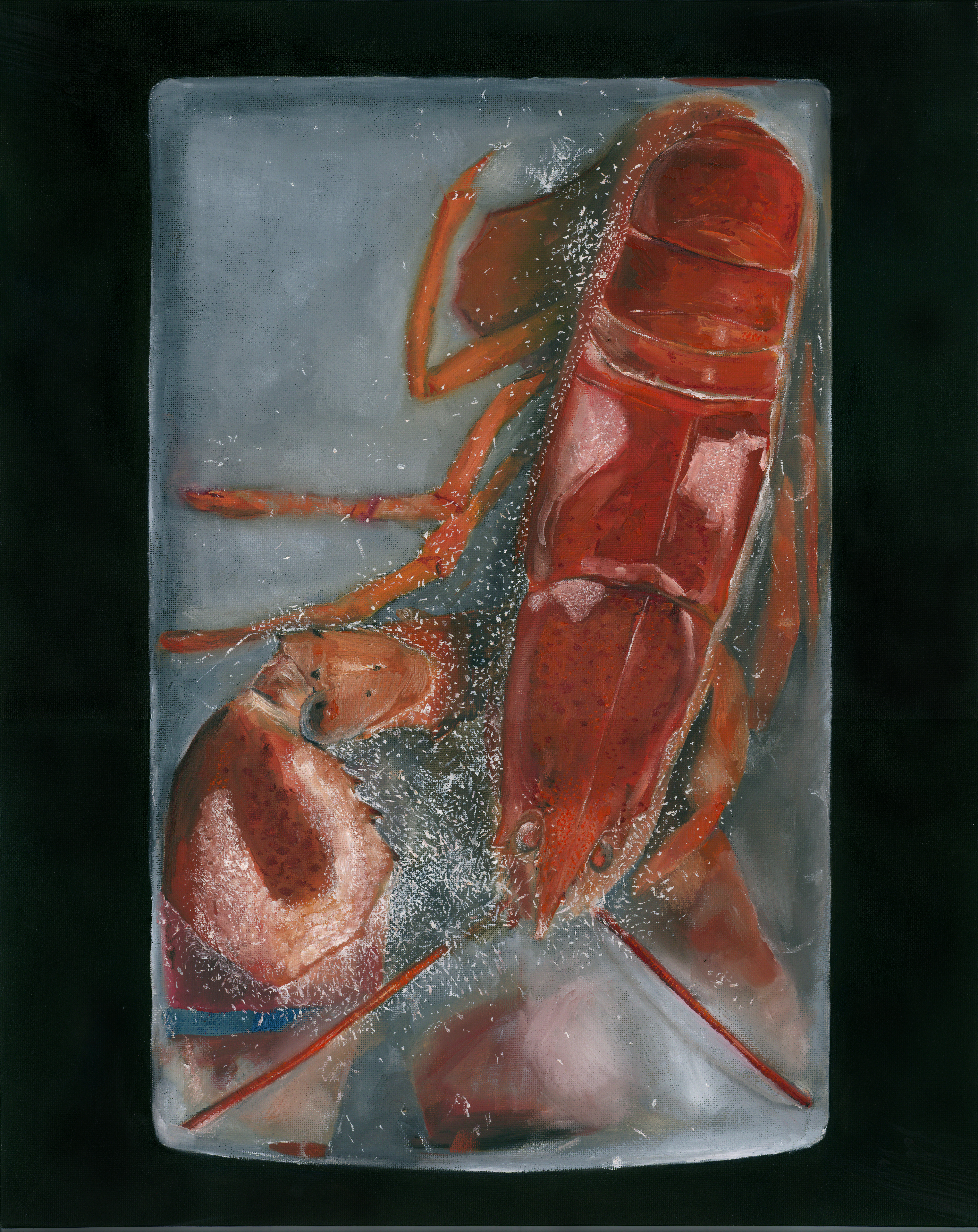 The theme for the group exhibition was 1.2.3.4 which we could interpret how we wanted. For my images I wanted to make one image with one object, one with two and so on. My first image is of a lobster (which I actually had to buy) frozen in ice. I wanted to show the transparency distortion caused by the ice and its contrast with the emerging lobster. I wanted to use classical still life objects but combine them with more modern elements; in this case the rubber band and the ice, in the others it tends to be plastic packaging.
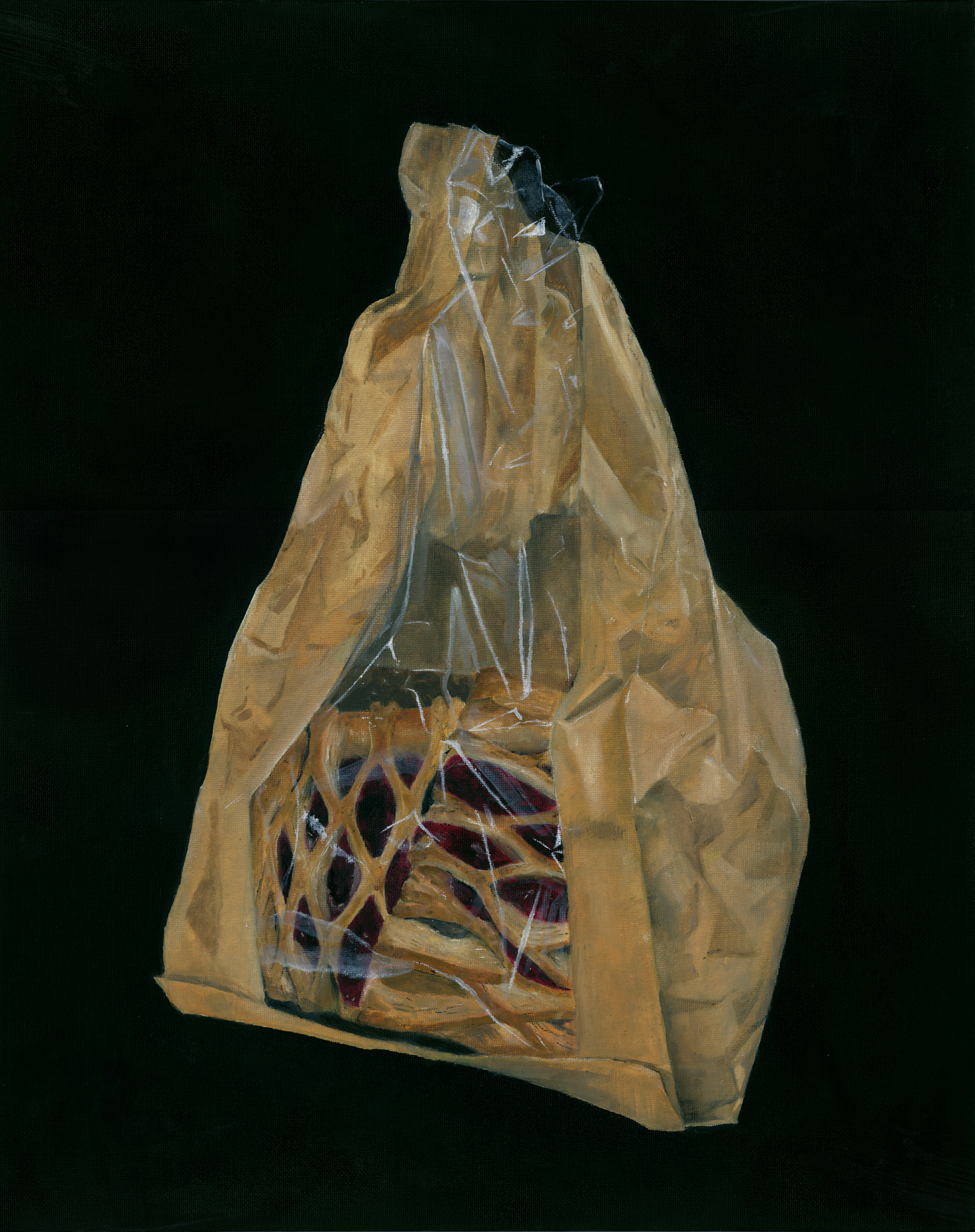 Two fruit lattices in a paper bag with a plastic strip. I quite like the rendering of the different textures in this painting, during the painting the object was throw away by the cleaner so I had to buy another one. This means that the plastic panel is not as accurate and has been made up a bit.
 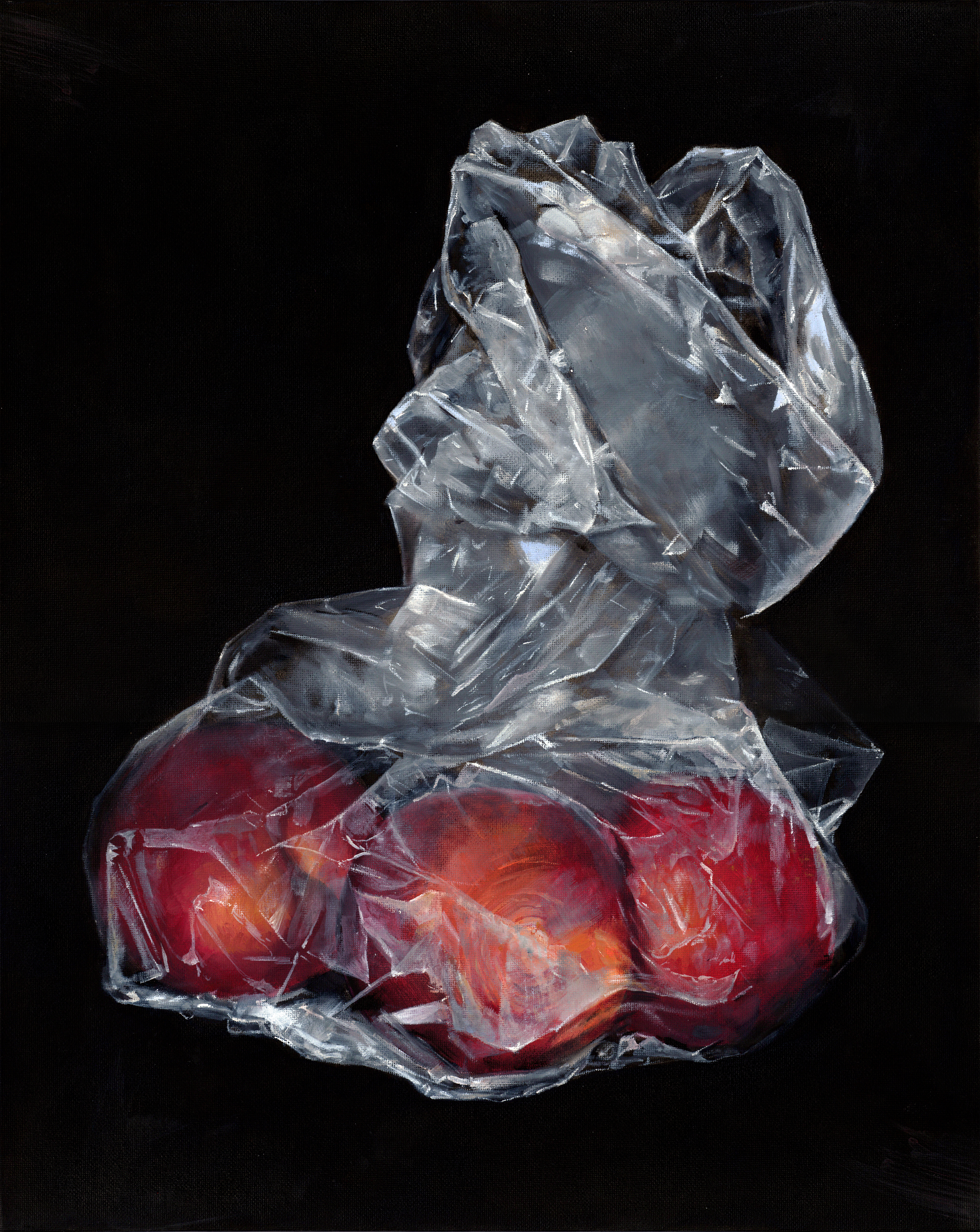 This is three plums in a plastic bag, it was quite enjoyable painting this as the plastic provided a challenge. The trouble was that the plums ripened during the process of the painting and thus changed colour, they were probably a nicer colour at the end but it was a bit late as I had already done the highlights.
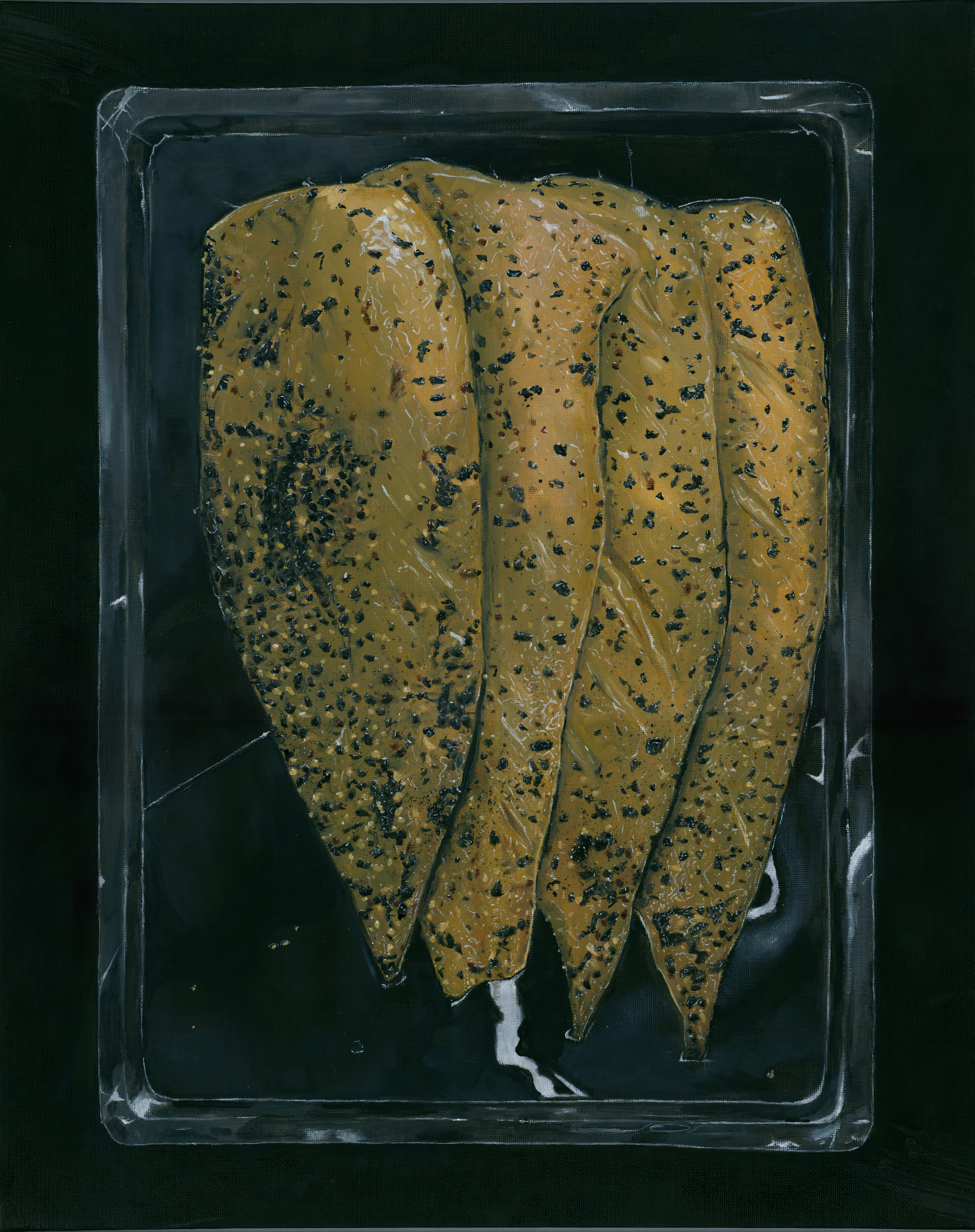 The last is four fillets of peppered mackerel in a vacuum sealed pack. This was the hardest of the four to paint as it as all the details were tiny even when blown up to this scale (A2). I was also concerned that some people didn’t realise that the actual object was vacuum packed, maybe this effect was too subtle for real life. This one does seem a little bit flat in some areas.
Ukraine – Windows and Spaces
Posted: May 11, 2015 Filed under: subject | Tags: art, illustration, Odessa, oil paint, Ukraine, windows Leave a comment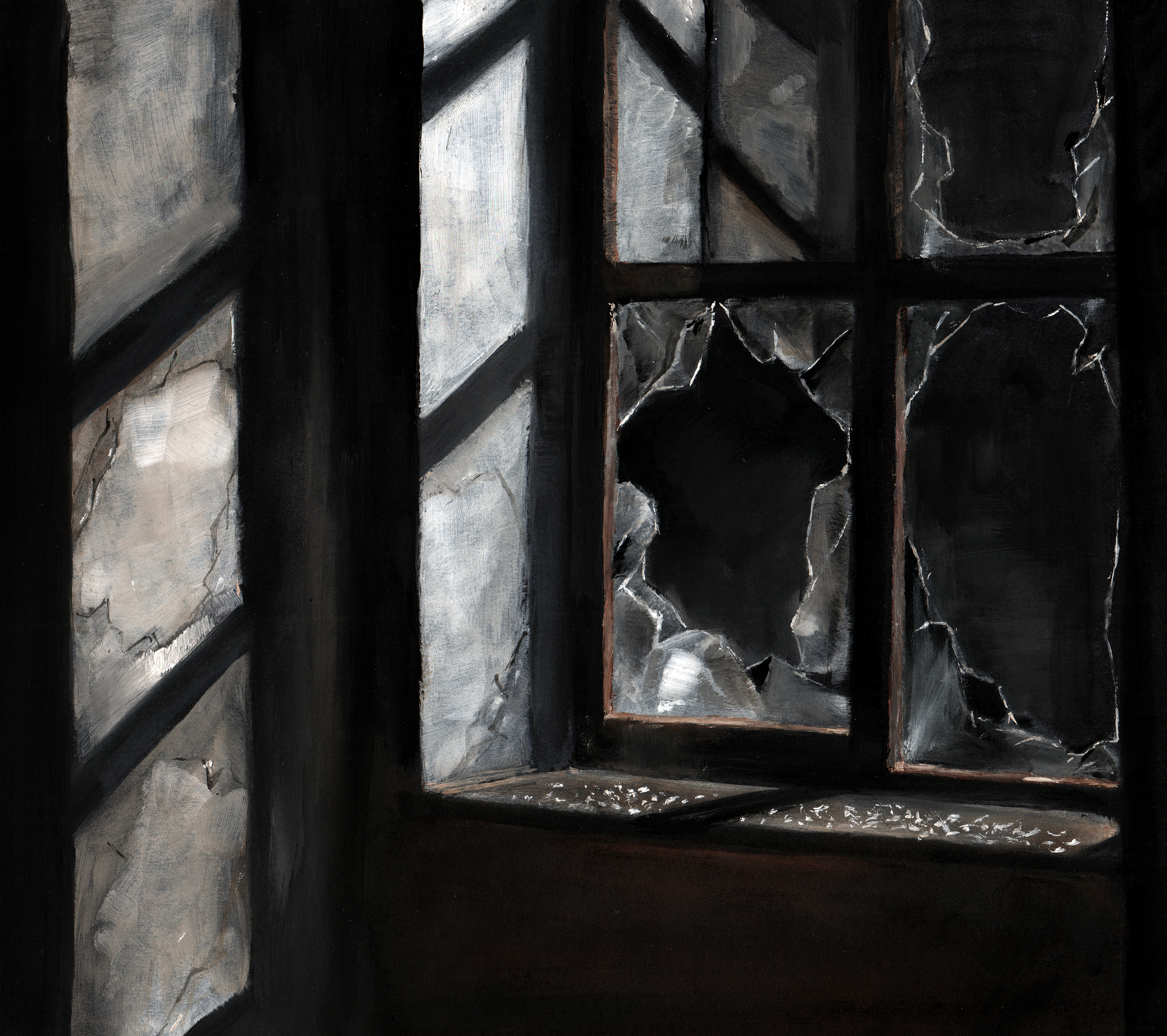 Looking more at the spaces which have been affected by the conflict, I am able to represent the situation without needing people. The paintings of Edward Hopper came to mind which showed spaces in a very cold and melancholic manner, I wanted to do something similar but without any people, just using architectural space. I like the composition of this image and the play of light. It could be improved by straighter edges and better rendering of the glass.
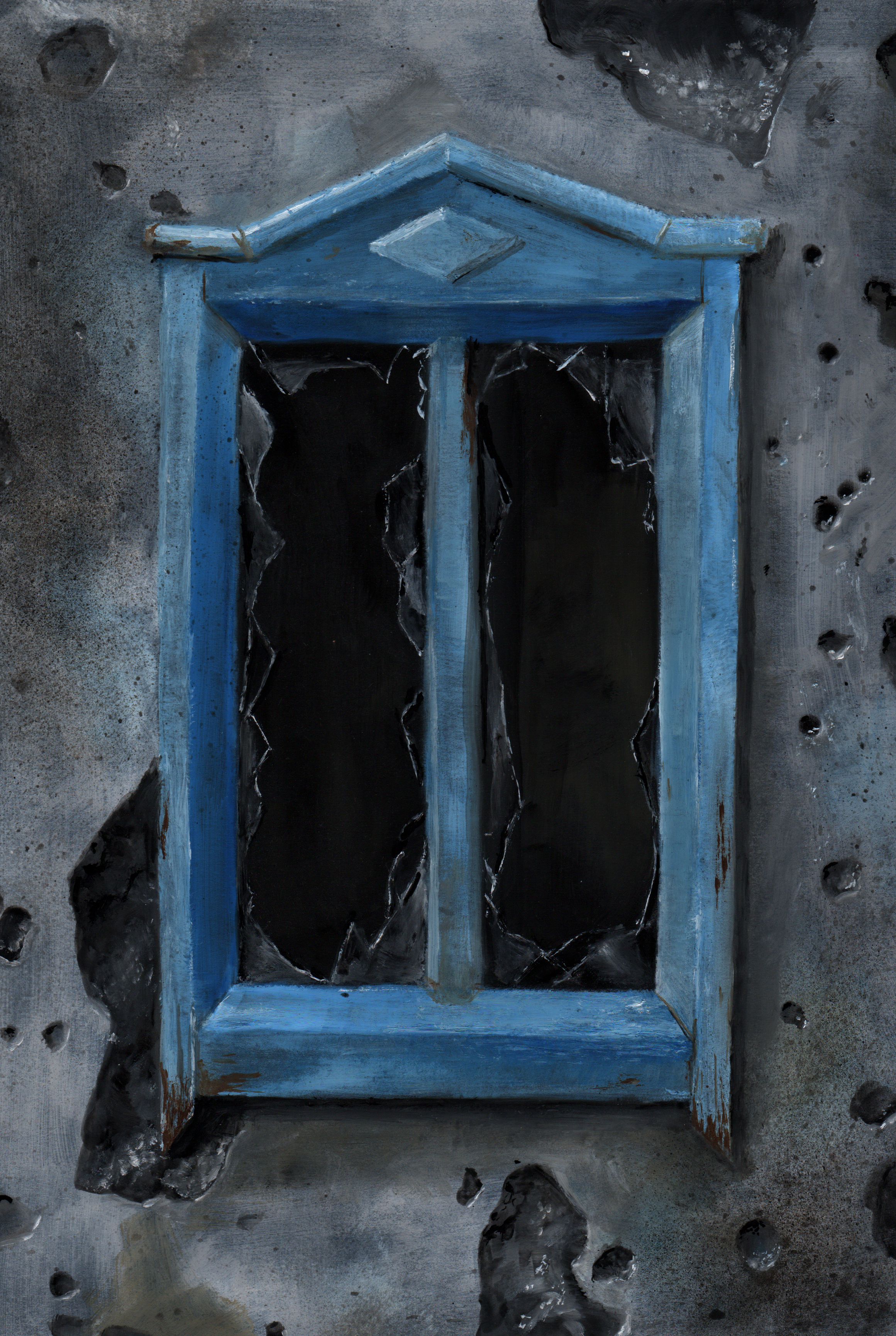
 This is a window covered by a sheet from what I think were military exercises. Here the space is limited and flattened but I think that the glow provokes an emotional response through its stillness.
 This window is on a wall that has been damaged by shelling, the flat straight on view draws in attention. The marks however draw your attention outwards to what is happening outside the frame of the picture, leaving the viewer to ponder the surrounding situation.
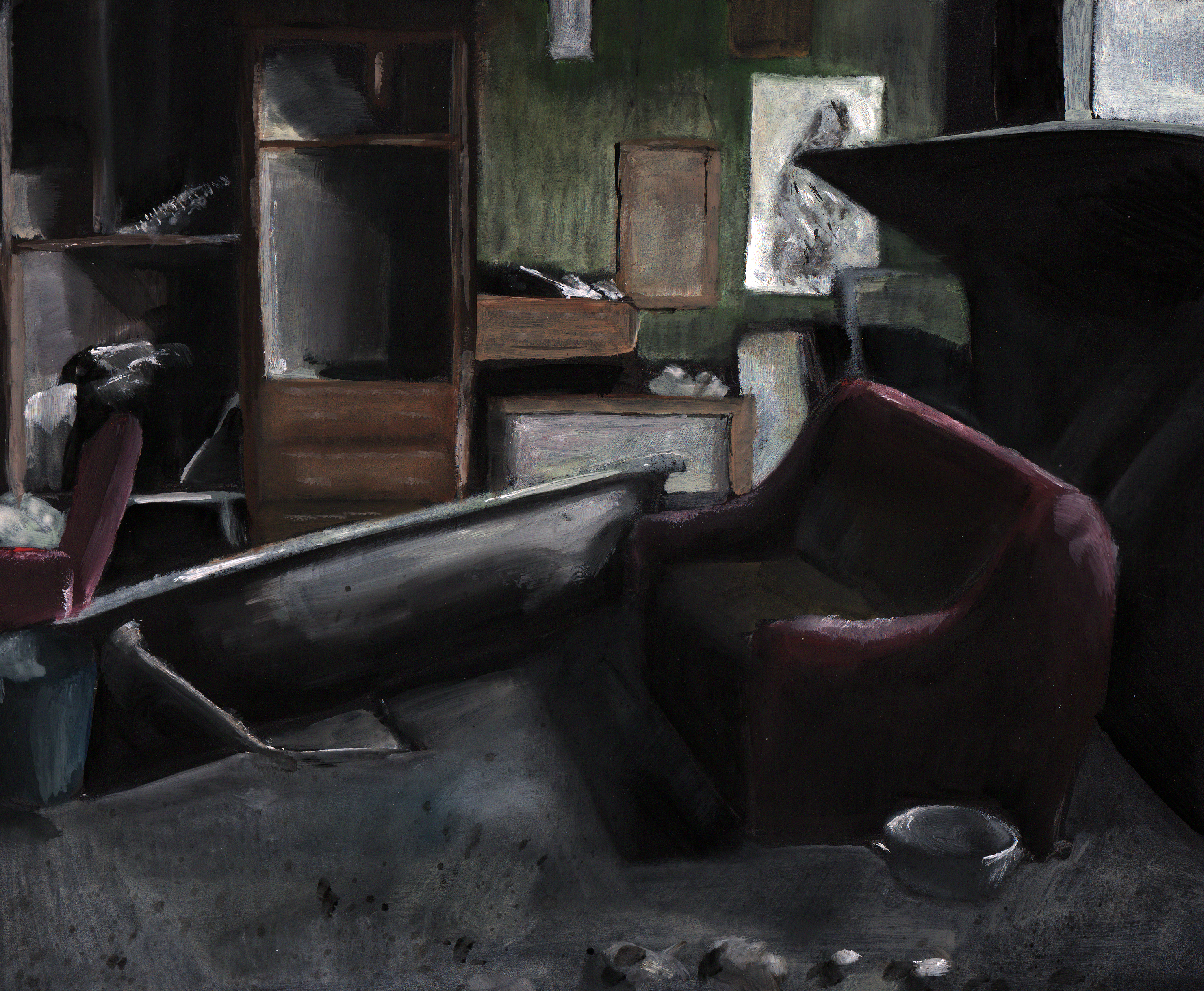 This image probably needs more definition as it feels a bit fuzzy, but I think that the colours and composition work well. This room is probably relatable to most people as it is not far from rooms common to the western world, so a greater empathy can be created.
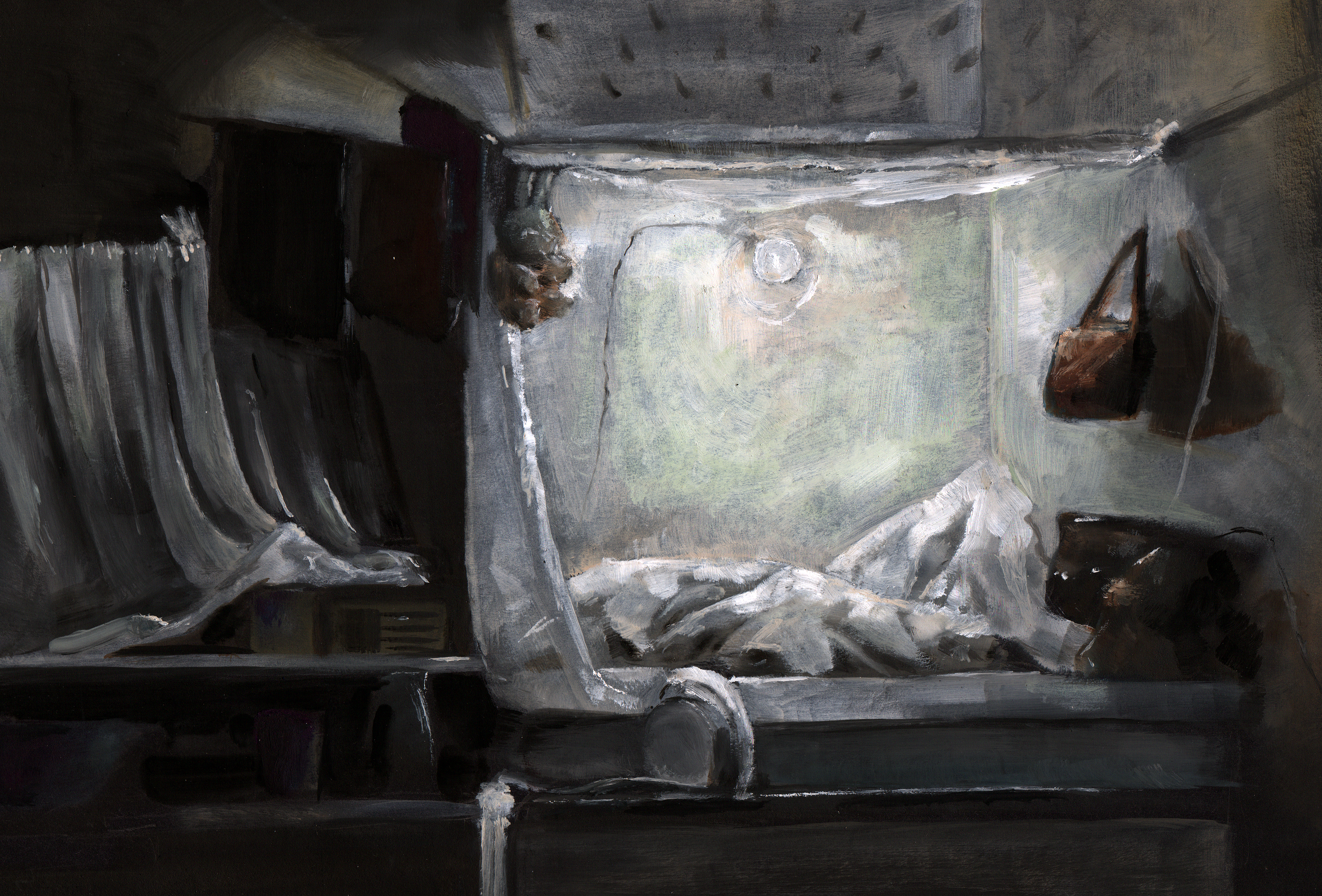 This is another space in which someone is living and again modern conveniences bring this closer to home. My favourite part of the image is the way the light interacts with the material and creates shadows. I think I should have put more time into painting some of the individual objects as they aren’t all recognisable.
Donetsk Airport
Posted: May 10, 2015 Filed under: subject | Tags: airport, art, conflict, Donetsk, illustration, oilpaint, Russia, Ukraine Leave a comment Using imagery from the Donetsk airport where there was intense fighting I have experimented with range. The first image is of smashed glass stained with blood. I’m not sure that the texture f the sharp glass fragment has been properly realised. The second is zoomed out much more to an aerial view of the airfield after heavy shelling. The difference in the viewpoint of these two images creates an element of abstraction as they are removed from our everyday view. I think that the painting could have been a little stronger as this looks to be a bit rushed.
 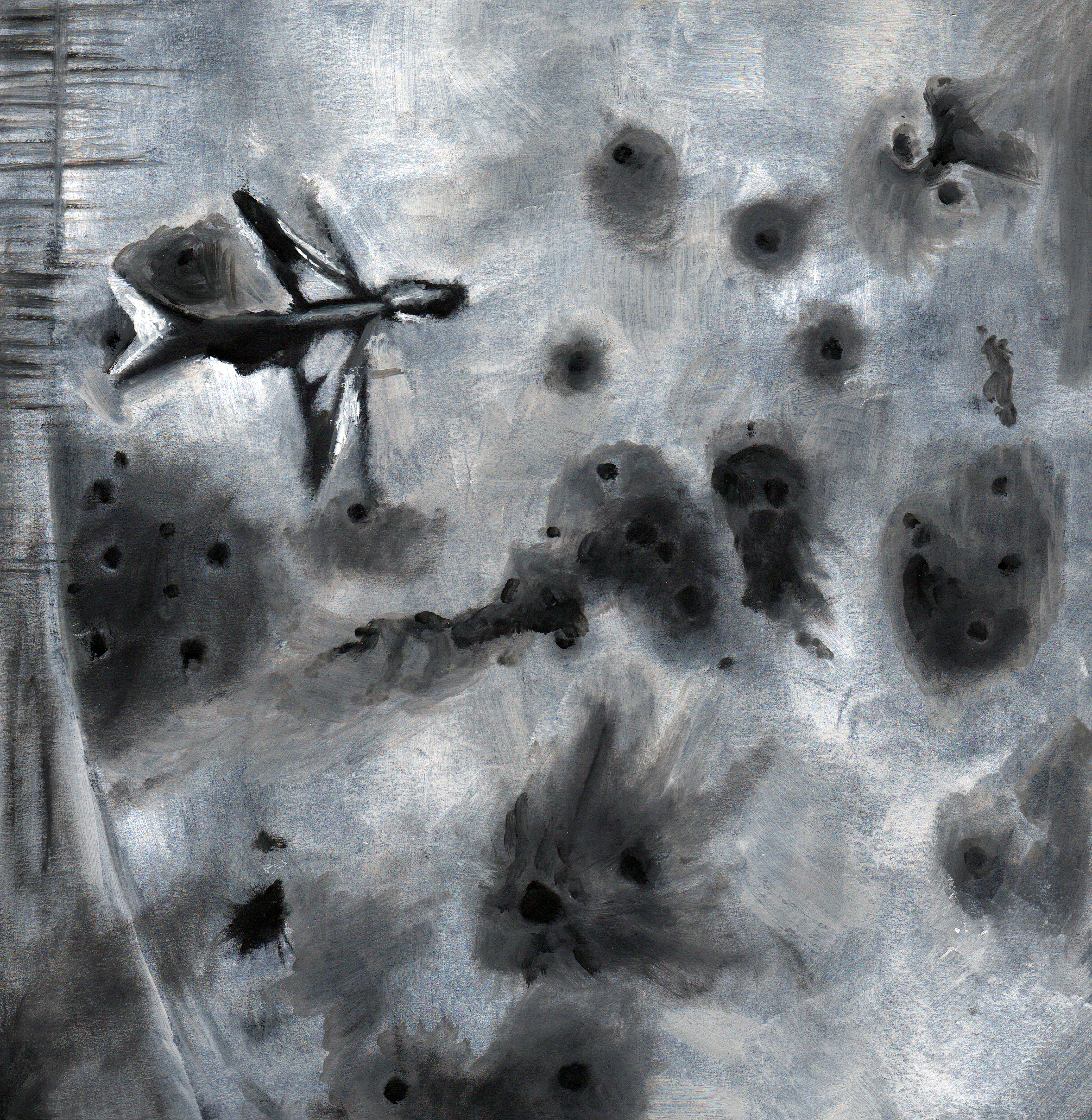 The third image is of the destroyed tower at the centre and provides a mid level viewpoint. I quite like the elongated shape of this painting but again I think it could have used more detail.
Ukraine – living in a war zone
Posted: April 28, 2015 Filed under: subject | Tags: art, illustration, oil paint, peaches, still life, Ukraine Leave a comment Returning to a more classical still life setup I’ve used the water bottles which are used by the people surviving in the areas without power. The bottles aren’t perfect, I’m going to blame that on working from a very small and poorly lit photo.
  Again using a classical still life setup Ive chosen three items from what was a cluttered kitchen. The objects speak of survival rationing and aide. I quite like the idea of this image but I would have preferred the objects to be more definite. They look a bit Cézanne-esque with the imperfect ellipses which isn’t really the style I was going for. I think the surroundings would benefit from a reduction or increase in detail as they seem a washy and flat.
Ukraine conflict continued
Posted: April 27, 2015 Filed under: subject | Tags: art, illustration, maidan, oil paint, shelling, statue, Ukraine Leave a comment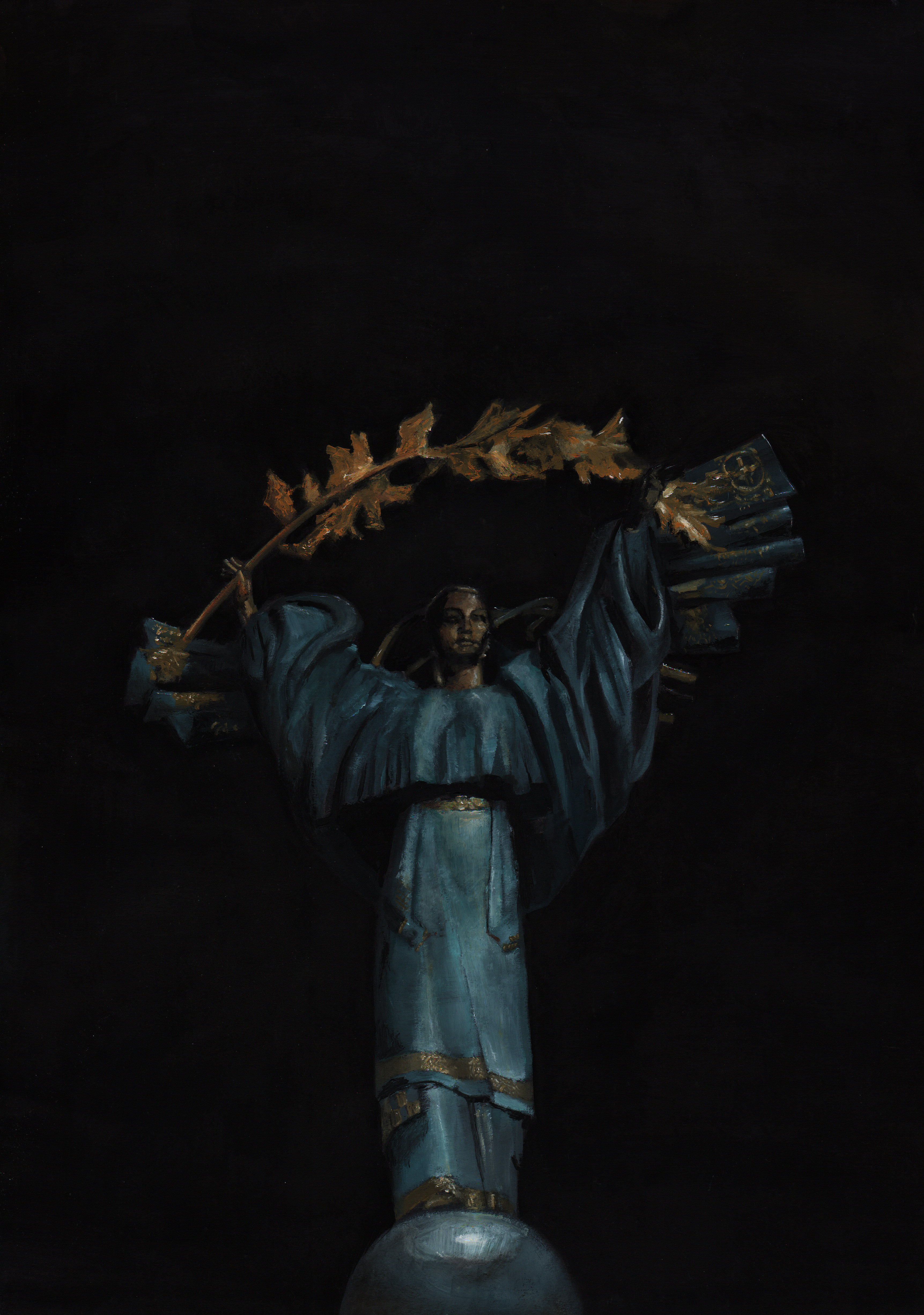 This image uses the statue at the centre of Maidan square which is a calm point at the centre of what was a violent revolution. The black background gives more calmness and stillness than if it was against the smoke and destruction. I do like the colour scheme although it just the actual colours of the statue.
 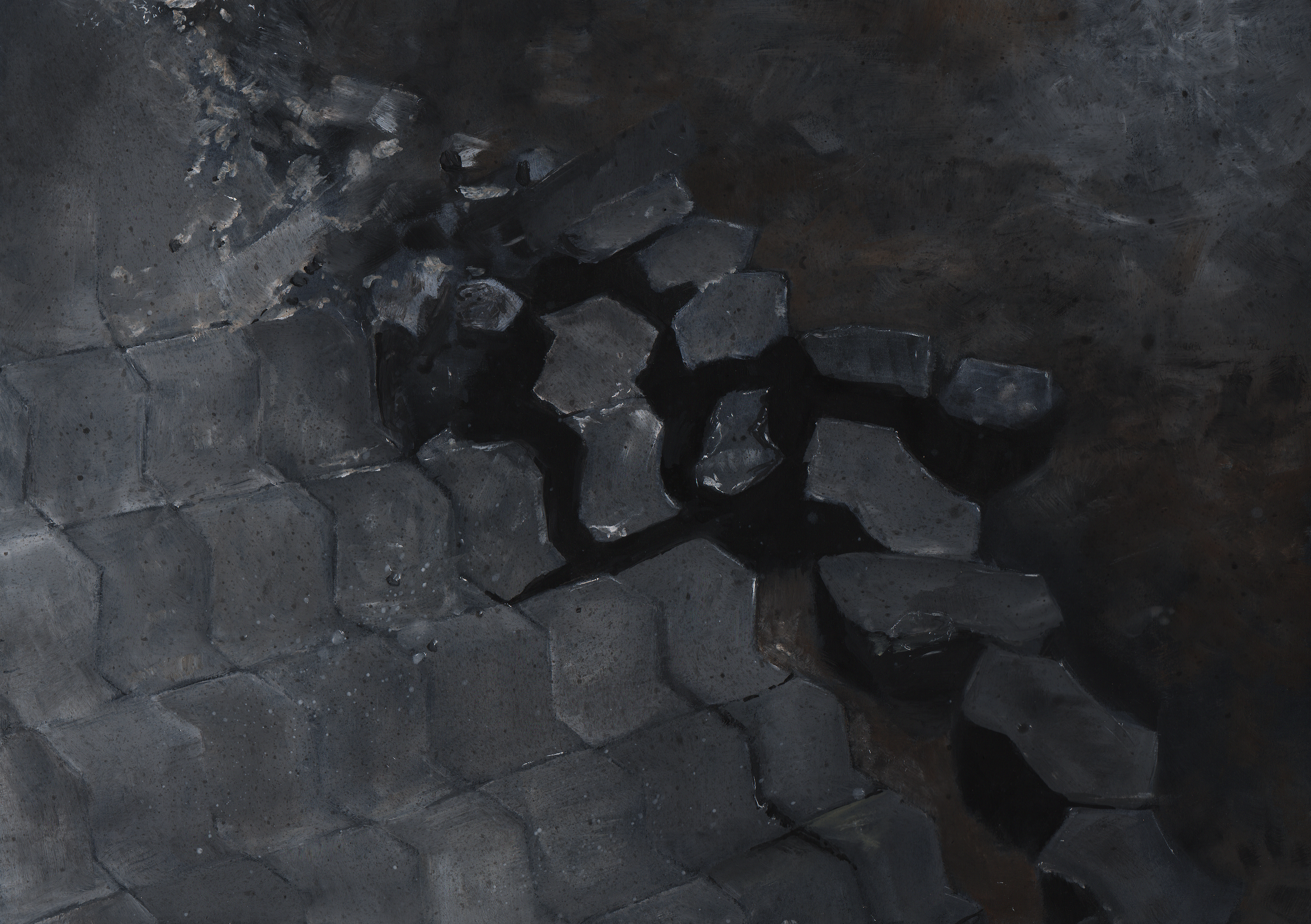 These are the paving stones which were torn up by the protestors to be used as projectiles. I don’t think this image works too well as the shapes are off so they don’t have the feeling of solidity. A lot of the image also feels rather vague resulting in there being no clearly identifiable subject.
 Taking frames from some amateur footage of a town that had just been shelled. This painting focuses on the body of a dead person who’s clothes have been torn in blast. By cropping in it removes the immediate shock or gore of a dead body. Although the visible bruised flesh is still gruesome and of the body which i think may be a bit much. The main problem is that it is once again not entirely clear what it is this picture is of. More detail or a different composition would have helped to give a better sense of what one is looking at.
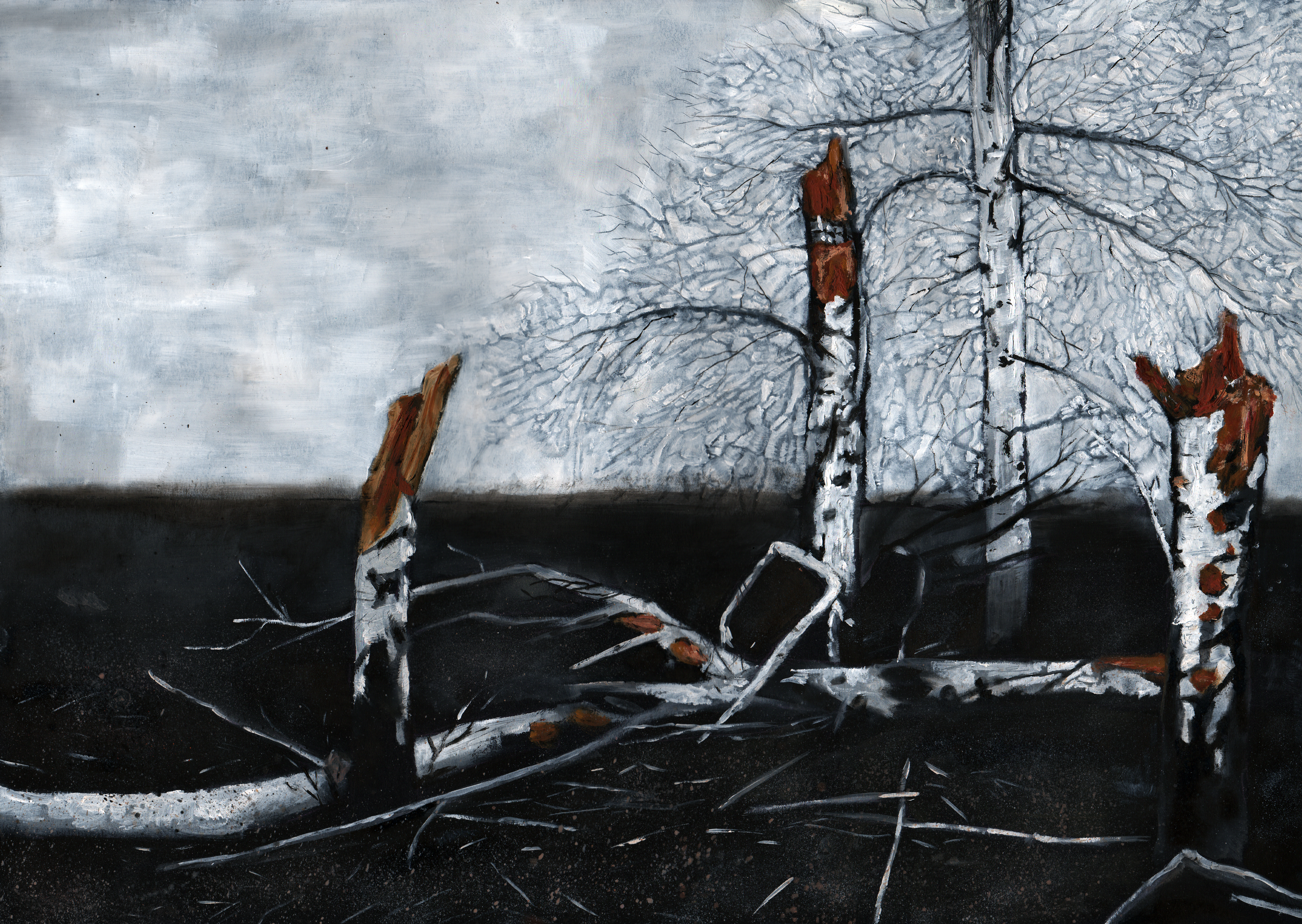 For this image of destroyed trees I have removed the background buildings to allow more focus on the trees and to keep a more simplified colour palette. While I quite like the composition, I find the painting is a little lacking. The beaches were very fiddly looked very stylised, I would have also preferred a richer texture on the trunks and the exposed wood. The trees are in some ways personified, allowing people to relate to them, but without having to show actual people who are being effected by the conflict.
Ukraine Conflict
Posted: April 26, 2015 Filed under: subject | Tags: art, crash, illustration, Maiden square, MH17, oil paint, protests, Russia, Ukraine, war Leave a commentI have started a new project looking at the recent conflict in Ukraine. Using the footage and photography as a starting point I have started to make images which show the situation in the cold and detached style I have come to develop. 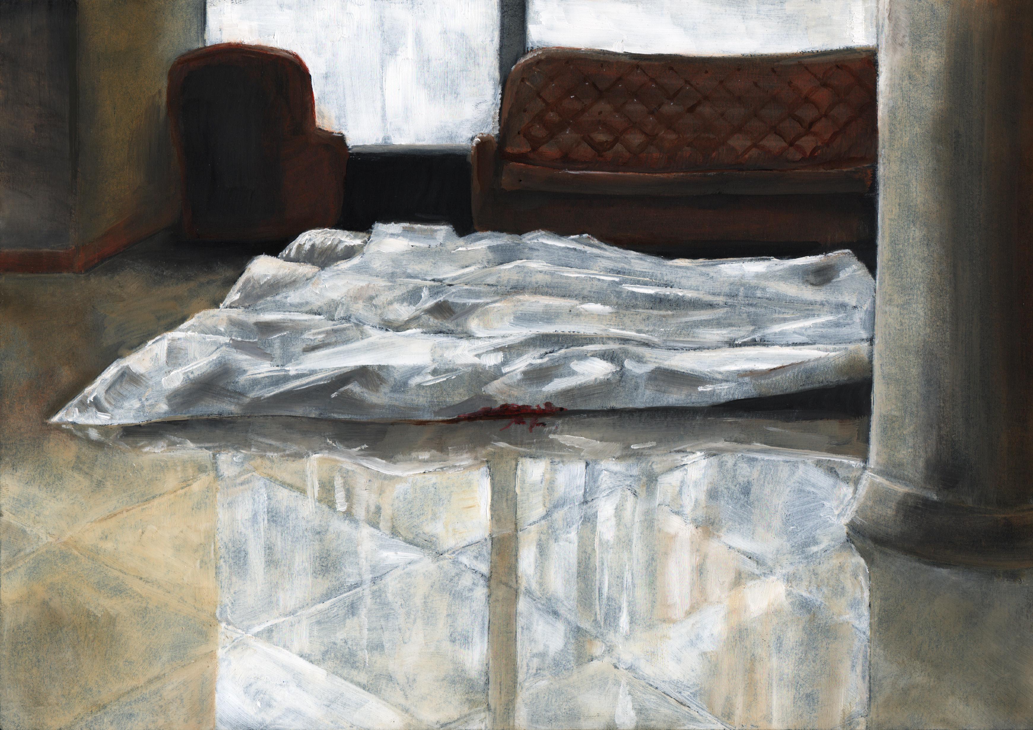 This image looks at a hotel lobby nearby to Maiden square on the day of the bloody clash between the police and anti-government protestors. Taking from footage from BBC news I have shown the bodies laying on the shiny floor covered in a sheet. It is the sheet that stops this image from being to graphic. I have put in a small amount of blood so as to make clear that it is a body under the cloth, but I feel that this may be a bit much. I think that the aesthetic of the hotel makes this feel more familiar to people as it looks part of the western world and brings the issue closer to home.
  This image is of a building that has been damaged by shelling, I think I could have put a little more time into this image as it is a little crude. While the colour is typical of the war torn buildings, I think that more detail and sharpness would have made the image more convincing. I should have probably also tried to make the tiles straighter as that would have created a greater feeling of solidity.
 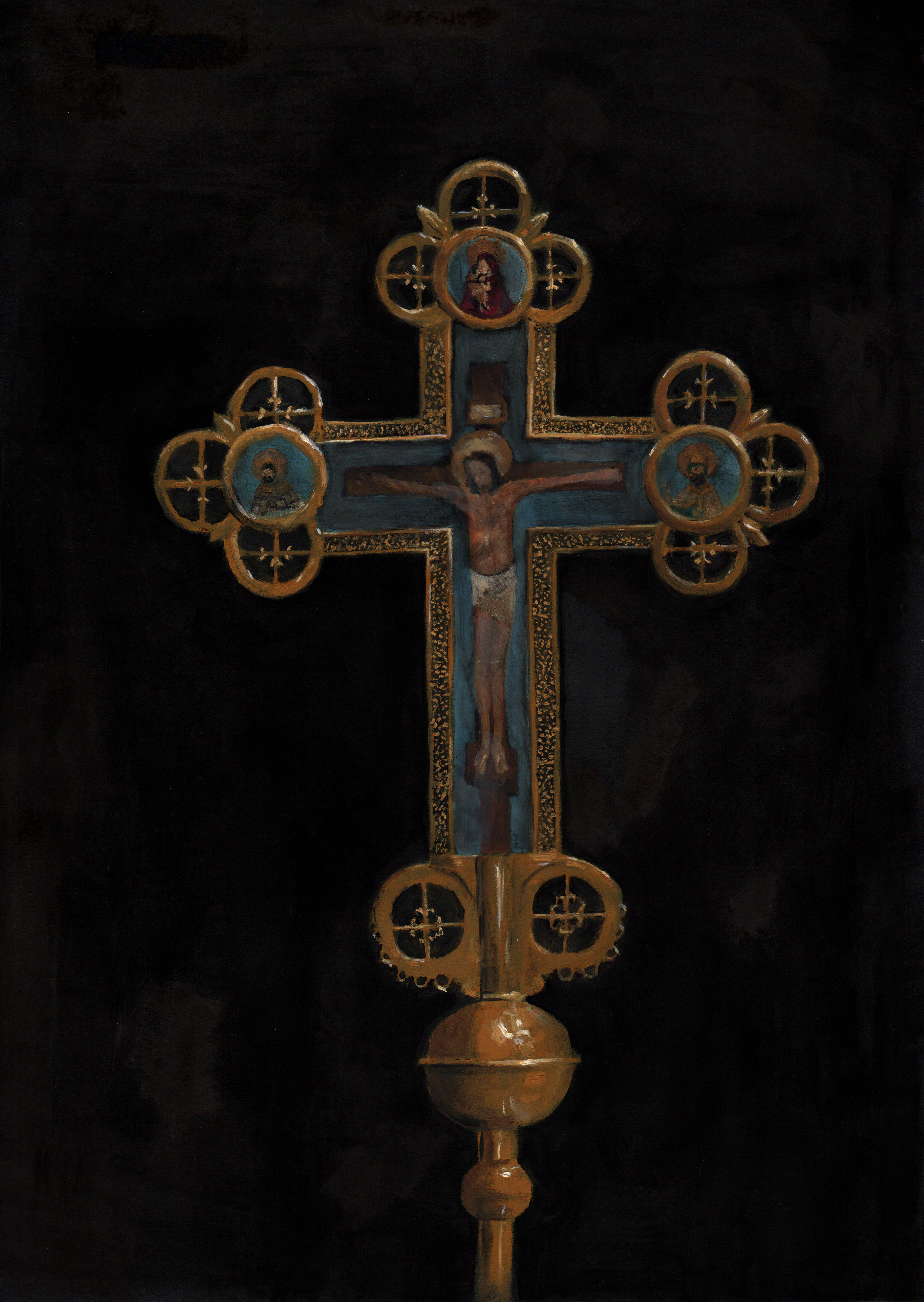 This cross is one held up by the orthodox ministers standing in-between the two waring sides calling for peace. While I feel this image does give across an emption quite well with its clear symbolism and eastern european style, I think the painting could do with some work. The shapes are distorted and the highlights are inconsistent, this problem mainly arose from the very low resolution images which I worked from. The paintings on the cross are also very crude, while they are meant to be painted in a medieval style they still lack detail but this would have been tricky working at the size I was.
  Showing the wreckage of the MH17 passenger flight which was shot down over Ukraine, this image creates a very grey landscape. It doesn’t show any of the human aspect of the incident, leaving that to the viewers imagination, on how the people could factor into this desolate situation. I find that the conversation works fairly well in this image but maybe the painting could be less washy.
Observational Work
Posted: April 26, 2015 Filed under: subject | Tags: art, biro, observation, oil paint, Paint, paper, still life Leave a comment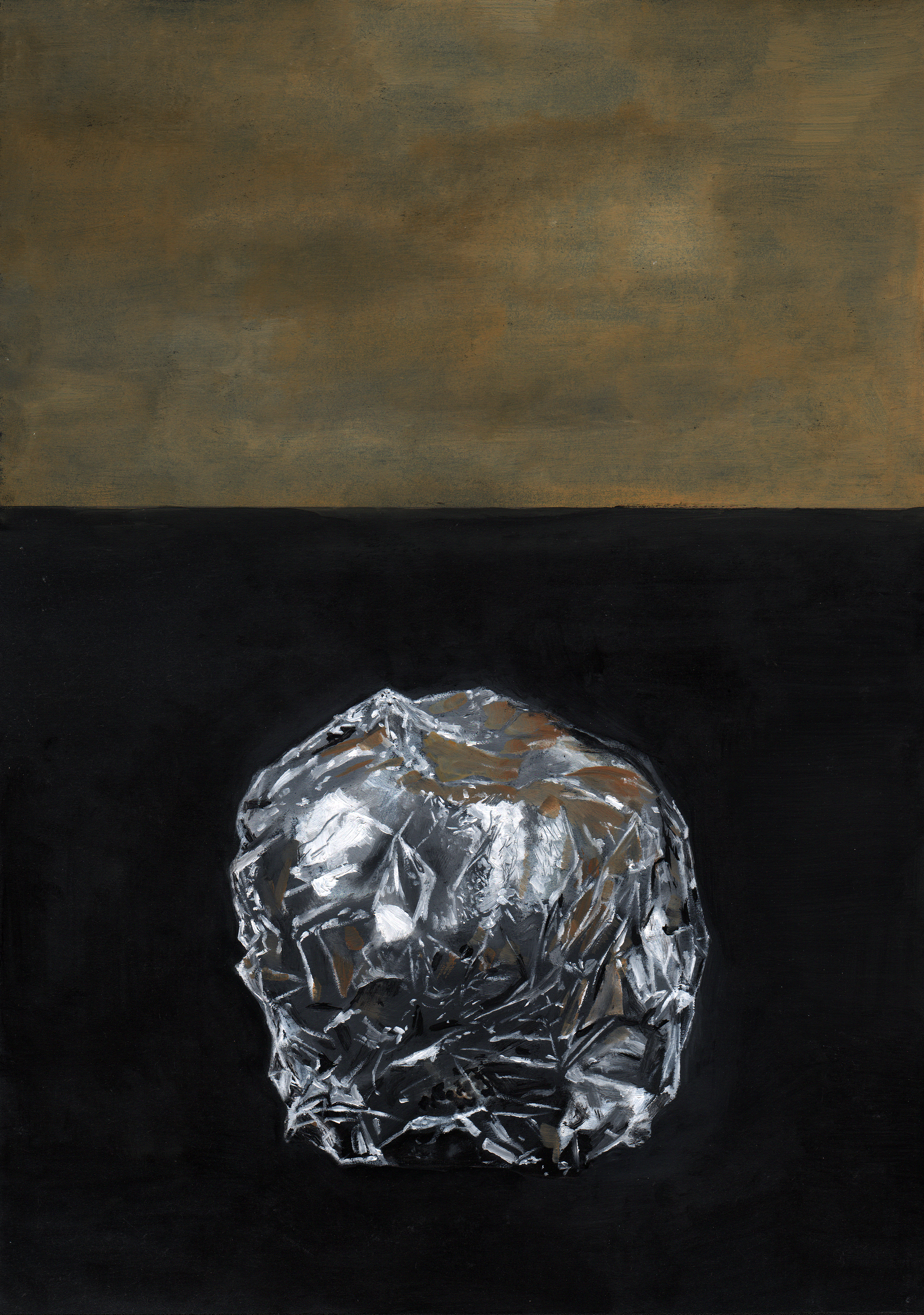 Following on from The King in Yellow, I wanted to do some work from firsthand observation. The foil apple proved to be quite challenging as i hoped it would, the amount of tiny highlights were quite tricky. I included the brown section as in my studio the mdf walls were picked up in the reflection which I needed to include, the top section gives a reason for the brown on the foil.
 The piece of screwed up paper provided the problem of the very sooth with subtle shadows and highlights. I don’t think the smoothness has been translated very well as in parts it looks more like tissue paper. I do like the composition of this almost abstract shape and on the black background it looks pretty clean.
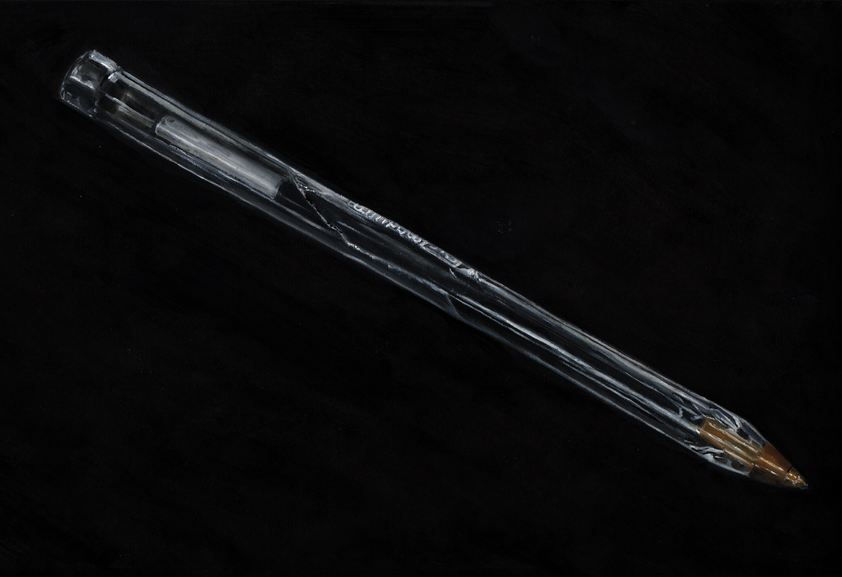 The Biro’s straight lines of highlights were the main challenge on this piece as they are fundamental to making the painting look realistic. The text was also a hassle especially at this size (A4), I used a scalpel to scrape the paint away to give cleaner edges than what the brush laid down.
1.2.3.4 – Group Exhibition
Posted: April 26, 2015 Filed under: subject | Tags: art, bristol, exhibition, gallery, painting, paper Leave a comment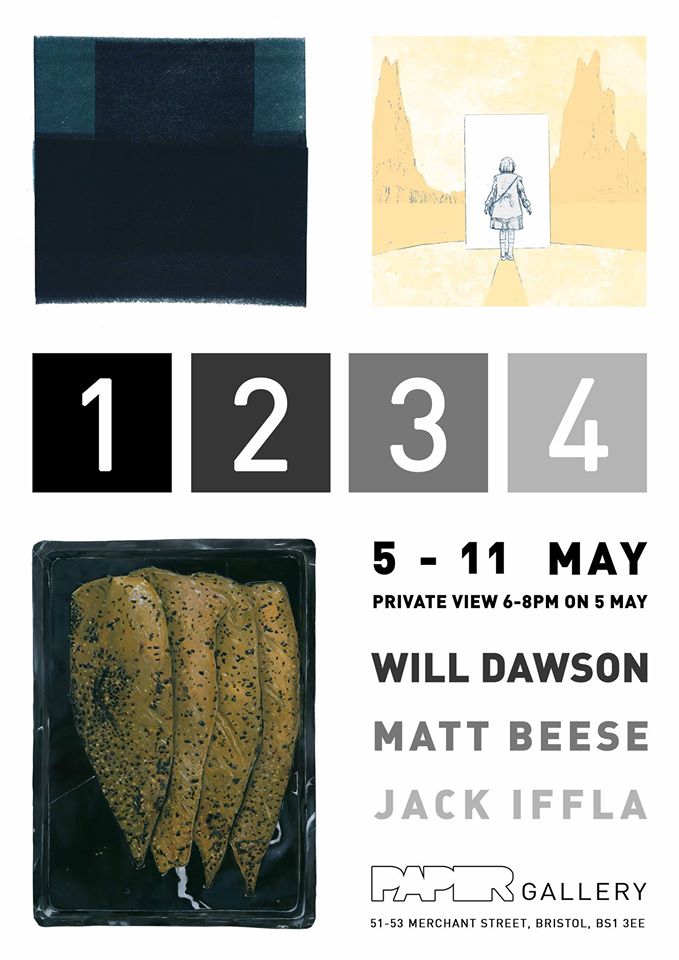 Me and two other colleagues have organised an exhibition of our work. It will be displayed for a week in Bristol’s Paper Gallery and will feature work for sale from each of us.
http://paperarts.org.uk/Gallery/
The King in Yellow – The Demoiselle d’Ys
Posted: March 16, 2015 Filed under: subject | Tags: hare, illustration, literature, oil paint, Robert W Chambers, short story, The Demoiselle d'Ys, The King in Yellow Leave a comment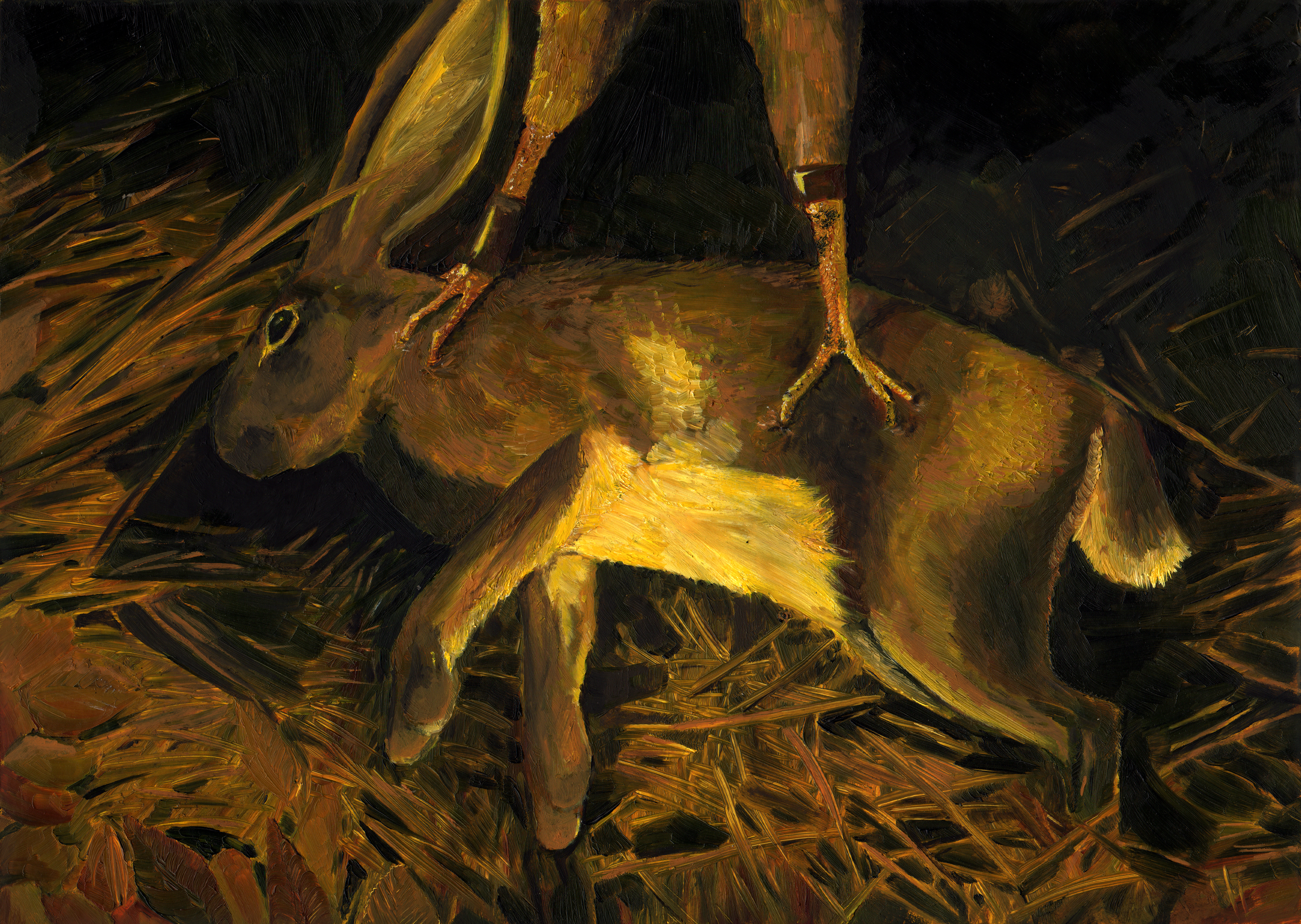 This story features a man walking on the french moors, lost until he is found by a woman and her helpers. They take him back to the castle where the man and woman become infatuated with each other, it turns out she’s from the past and he is returned to the present. The image I’ve used for this story is of the hare which is caught at the start of the story by a falcon. It gives across the feeling of threat and has a rather medieval subject matter. This picture had a lot hard things to paint in; the close up grass, the fur, the feathers and the textured bird skin. The darkness of this image does give a strong sense of atmosphere.
The King in Yellow- The Mask
Posted: March 16, 2015 Filed under: subject | Tags: illustration, literature, oil paint, Robert W Chambers, short story, still life, The King in Yellow, The Mask Leave a comment This story is about a marble sculptor who invents a liquid that turn anything to marble. In the story he uses it on a gold fish and a flower before using it on people. These two objects take on the symbolism of the two characters. The picture is set on the sculptors desk with hints at cloth, tools and rubble. The challenge was making it look like the objects were made of marble without being able to use the obvious colour change. So the only real method was to make them look stiff and shiny. I quite like the triangular composition of this image, it feels more like a classical still life.
The King in Yellow – The Yellow Sign
Posted: March 16, 2015 Filed under: subject | Tags: illustration, literature, oil paint, Robert W Chambers, short story, The King in Yellow, The Yellow Sign Leave a comment At the beginning of the story the protagonist, an artist ruins his painting. The paint runs and bleeds to a muddy mess, this is what I have attempted to portray in this painting. I’m not sure if it is clear that at the foreground is a canvas with a painting on. The background, the curtain and window seem quite lazily painted and a little crude, but the lack of detail does mean that your eye is drawn more to the detailed tuned painting. I have tried my best to remove any recognisable features from the panted figure as I felt a face would be a bit distracting.
The King in Yellow – In the Court of the Dragon
Posted: March 16, 2015 Filed under: subject | Tags: illustration, In the Court of the dragon, literature, oil paint, Robert W Chambers, short story, The King in Yellow Leave a comment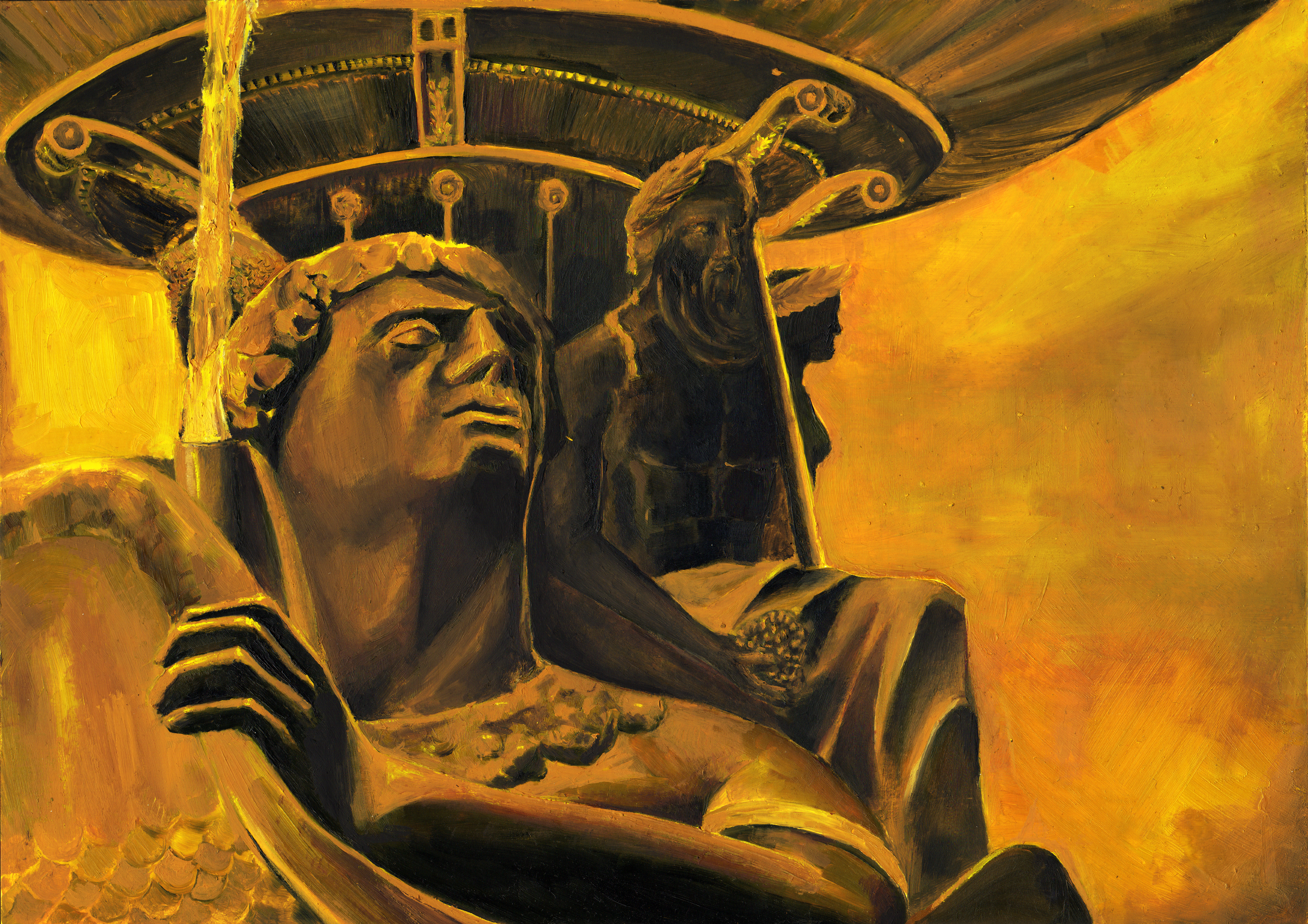 In this story the narrator leaves a church because he is scared of the organist. He runs though Paris in fear that he is being followed, in doing so he passes the place de la concorde. The fountain there is featured in the image, using the figures in place of the characters. The statue is looking over his shoulder in a paranoid manner (well at least it can be seen that way), with the dark imposing figure behind. I have changed around the composition of the fountain so that these two figures line up in this manner. As with all of the images in this series a heavily yellow colour scheme has been used to show the creeping influence of eponymous play. The figures and forms have not been done that well and I would have preferred for the background figures to have been darker and more mysterious.
The King in Yellow – The Repairer of Reputations
Posted: March 15, 2015 Filed under: subject | Tags: crown, illustration, literature, oil paint, Robert W Chambers, short story, The King in Yellow, The Repairer of Reputations Leave a comment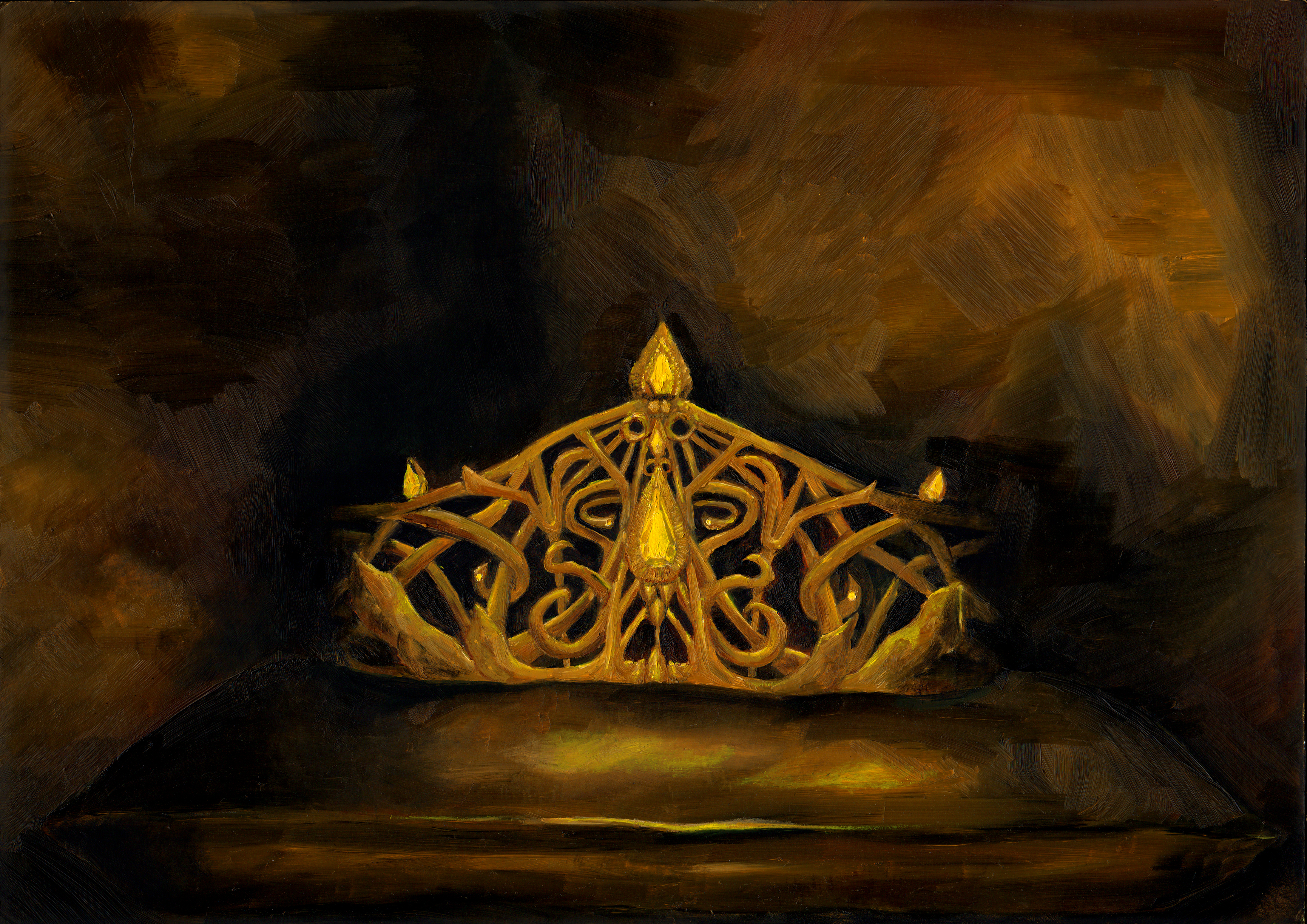 This story centres around a character with a warped perception of he world and is therefore an unreliable narrator. Subway stations are seen as death booths and in his safe is a crown of gold and emblazoned with diamonds which in fact is copper and paste. The crowns design is inspired by art nouveau jewellery. It is at a midpoint of grandiosity, as it is meant to be extremely precious to him but it is described as a diadem for him to be a prince. The dark background makes the the crown stand out more and creates an ambiguous backdrop consistent with the mind of the narrator. The scanned in image shows up the brush marks more than in real life, which I’m not overly keen on as it makes the background less dreamlike.
The King in Yellow – cover
Posted: March 15, 2015 Filed under: subject | Tags: illustration, literature, oil paint, Robert W Chambers, The King in Yellow Leave a comment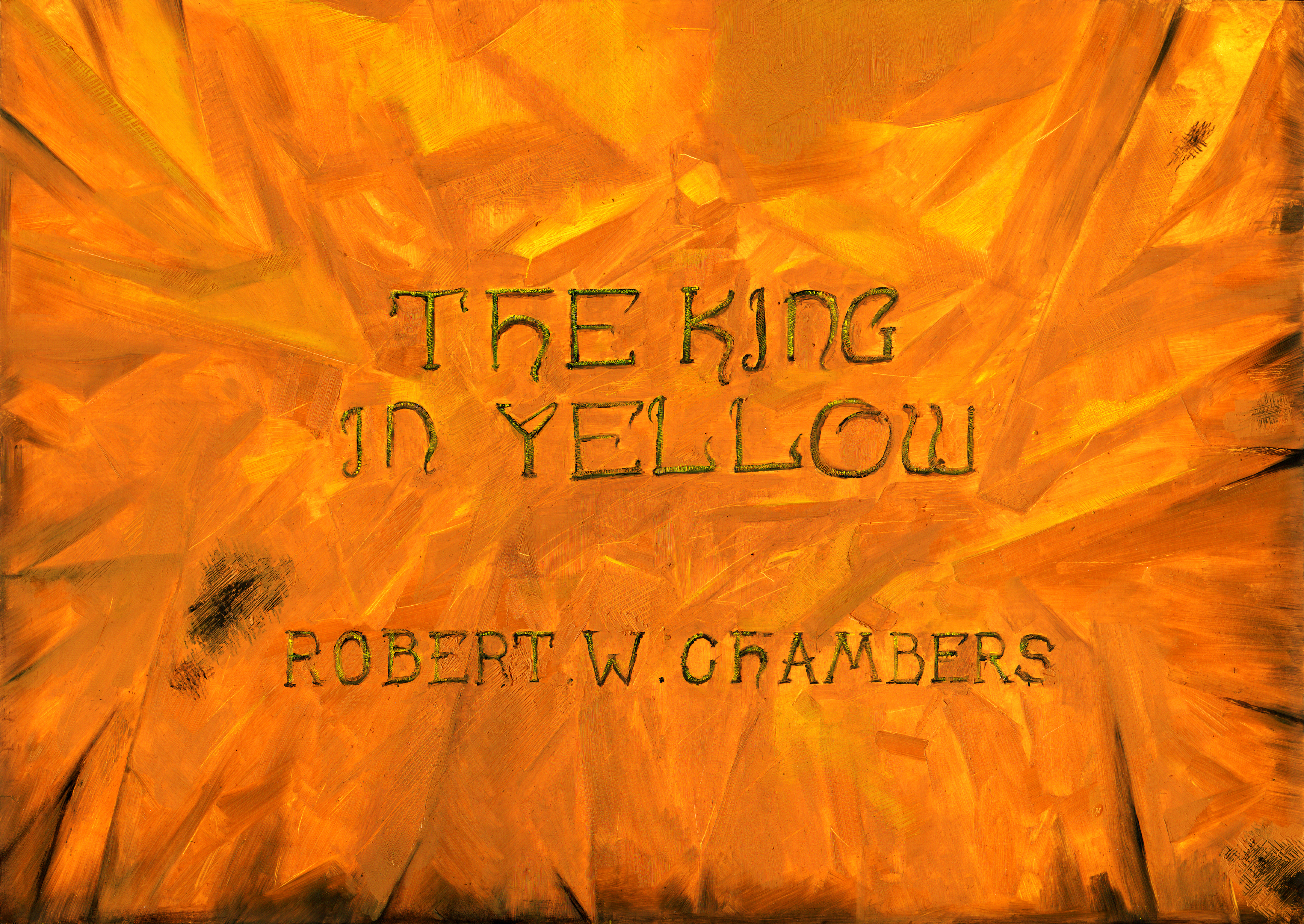 To create a cover for this collection of stories I wanted to stay away from anything directly from one of the stories. I also didn’t want to show the king in yellow. So I decided on a material look with the text ‘stitched’ on as this ragged effect would match his robes. For the font I wanted to use art nouveau inspired lettering, as the book was written as part of the decadent movement which was closely associated with art nouveau. I’m not sure that the text looks as though it is attached to the material, it seems to float above. The text is quite subtle which means that it takes slightly longer for it to reveal itself to the viewer.
Ozymandias – Percy Bysshe Shelley
Posted: March 15, 2015 Filed under: subject | Tags: art, illustration, oil paint, Ozymandias, poetry, Shelley, statue Leave a comment This is a picture I did over the summer but forgot to blog. Based on Shelleys poem of the decaying statue of a once powerful ruler. The real Ozymandias was an Egyptian pharaoh but I wanted to update it to show the poems relevance throughout time. Part of the head and the nose are missing missing, but I’m not sure how clear this is. The nose looks a bit like he has a clown nose on and the missing fragment of head looks like its just being drawn wrong. I do like the colour scheme of this image though as it feels cool, clean and classical. I find that the composition also gives a sense of time and history, with its amount of blank space.
All Summer in a Day – Ray Bradbury
Posted: February 18, 2015 Filed under: subject | Tags: all summer in a day, illustration, oil paint, Ray Bradbury, Sci-fi, short story 1 Comment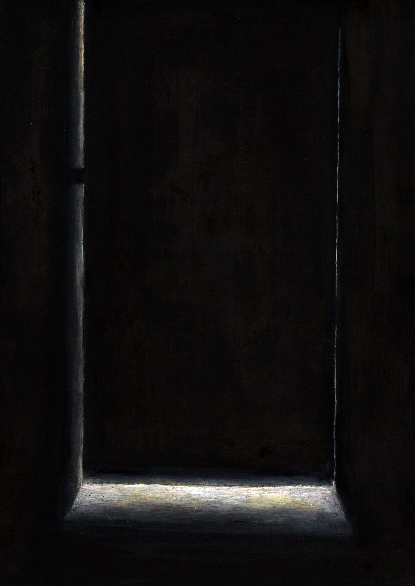 In this story a class of school children on Venus wait for the short period of time where it stops raining and the sun comes out. The one girl who has seen the sunshine before is locked in the cupboard by the class and misses the event. The picture is from her point of view inside the cupboard with a crack of light shining underneath the door. I think this helps the viewer to empathise with the girl. There is a lot not shown in this picture so most of the sci-fi elements are left to the readers imagination.
There Will Come Soft Rains – Ray Bradbury
Posted: February 18, 2015 Filed under: subject | Tags: illustration, literature, oil paint, Ray Bradbury, Sci-fi, short story, The Martian Chronicles, There Will Come Soft Rains Leave a comment In the story a futuristic house goes about its daily routine; making breakfast, hoovering, ect. The people are long gone, so it is just this house functioning for no real reason. A fire starts in the house and it starts to burn down. In the text it mentioned a Picasso burning, at the time of painting this I was still writing my dissertation on Cubism. I thought to use Picasso’s study of Horta, which features buildings as the subject, which look like futuristic geometric structures.
There were a few problems with paining this, the first being copying the original painting while also imposing the alteration in colour that being next to a large fire would cause. Painting flames also proved to be quite tricky, they don’t look very effective. what to do beneath the line of flames was a bit of a conundrum, I kept it simple and made a subtle allusion to the frame of the canvas. I think the white marks to show the sweating and warping paint are quite effective, the smoke marks running upwards also look ok. I think the original painting does get a bit lost with half of it missing and other elements laid on top.
9 Billion Names of God – Arthur C. Clarke
Posted: February 17, 2015 Filed under: subject | Tags: 9 Billion Names of God, Arthur C. Clarke, computer, gif, illustration, oil paint, Sci-fi, short story, temple Leave a commentIn Clarks story a computer operator is hired by a set of Tibetan monks to go an help them use the super calculator. They are attempting to find the name of god by using the computer to make all the combinations. My image shows the computer in the temple, with a contrast between the traditional and the technological. I have kept the image black and white so that these two elements tie together more. The pillars which are meant to be covered in decorative material do look more like the spinning brushes of a car wash.

The picture has a religious sense of stillness, to counteract this I have made a very subtle animation. It makes the lights on the computer blink, this creates more of a contrast between the calm temple and the computer. I find that the black pillar at the forefront of the image makes it more immersive as though it is being seen from the point of view of a character in the story.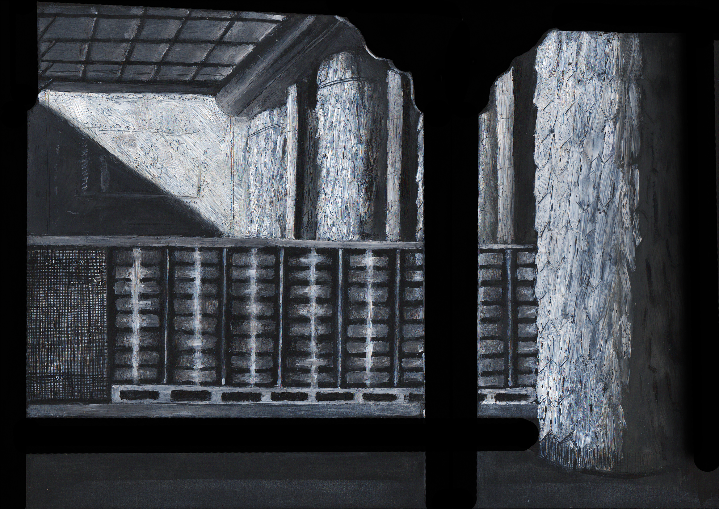

You must be logged in to post a comment.